When building a website for higher conversion rates, user interface (UI) and user experience (UX) are crucial considerations. The key to improving your conversion rates is to provide visitors to your website with excellent features. This article will explain how we can pragmatically multiply conversion rates simply by correcting a few UI/UX design issues without interrupting designs or development. A conventional pop-up animation needs to be updated and will not surprise anyone, but a modern website or mobile application design can be unique or outstanding.
Skilled UI/UX designers are developing new avant-garde features. The current UI/UX design swing make accentuates originality and innovation. It aids in grabbing users’ attention and drawing in a new audience. The UI/UX trends that will be most in demand are interactivity, logic model, 3D, and VR/AR.
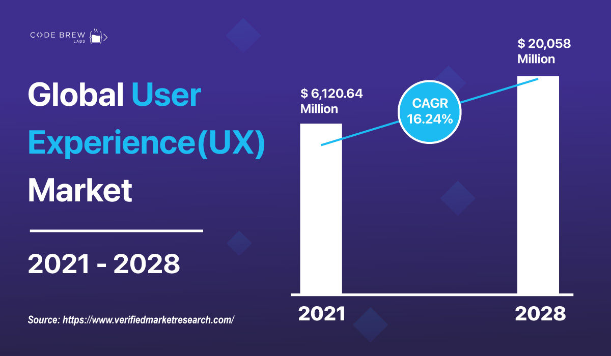
The user Experience (UX) Market size was valued at USD 6,120.64 Million in 2020 and is projected to reach USD 20,058 Million by 2028, growing at a CAGR of 16.24% from 2021 to 2028.

Placing the CTA button in the right place immensely influence your customers’ UX. The call to action button act as an emblem telling users what they need to write. Accurate CTAs bring the actual activity to have happened from the audience. Clean and Clear CTAs reduce the risk of your audience bouncing back from your page. Your CTA helps in increasing conversions. The more attractive CTAs more the traffic you will receive.
Call to action must include:
And more in the queue, stay ahead of your competitors.
Visual signals would be another simple way to improve your website’s user experience. Use icons, buttons, legends, and even images to keep visitors interested in your site. These provide customers with clear instructions on what to anticipate and how to navigate. Many visitors struggle to navigate because they find it difficult to get used to a modern user interface, especially those who are not technologically adept. Your revenue may be lost as a direct result of their difficulty and friction. Make sure the icons are self-explanatory or that mouse-over tool text is used to explain the icons’ function to the visitor. This guarantees that visitors stay on your website and increases their likelihood of completing the conversion process.
Nothing makes your customers more unhappy than deciding your product is the best option, but when it comes time to pay, they discover unanticipated fees or are informed that the item they want is out of stock, etc. At this point, 60% of business clients would quit and possibly never return.
If you have additional costs, let them know before you check out to resolve this. Use a pop-up message or a grayed-out graphic to let the visitor know about your presence. You can reroute them to substitute offers and concentrate on value rather than what’s lacking. If you think it would be wise to do so to lessen the likelihood of losing a convert, you may even provide extra value like promotional codes, coupons, surprise gifts during festive seasons, added functionality to existing offers, and so forth.
Create a “Notify Me” or “Recall” button as a final step so that your visitors will be alerted when your offer becomes available once more. It will help you generate an excellent lead that you may nurture in the future with their contact information.
Therefore, small UI/UX design improvements will accelerate to grow, run and, launch your business in a better way. Bring exceptional experience for your customers and minimize any negative effects on your revenue.
Most businesses lose visitors when they don’t deftly tackle challenging or undesirable circumstances brought on by a bad client experience. That is inevitable, so you need a strategy that works for you to keep your guests on board even if anything goes wrong. Instead of employing loud, unpleasant cautions like “Blunder!” or “Error,” test your forms and your journey. Provide an explanation and a link to your aid or customer support website if the issue cannot be resolved. Allow users to “support chat” or “heart-to-heart” so you can stay in touch.
Don’t let your business suffer because of small and insignificant reasons. Build a masterful business for your brand and take pride in catering industry-leading technology.
Yes, a picture speaks a thousand words, but downloading one might consume a lot of internet. How many words are needed to communicate? Finding the ideal balance between form and function rather than overcrowding your website with images can help you hold users’ attention and inspire them to interact with it. To guarantee that the page loads faster and leaves sufficient white space for your layout to thrive, fewer banners, photographs, and other images should be used.
Additionally, websites with excessive graphic content will load more slowly and provide a bad user experience. The likelihood of a visitor leaving increases when they feel the website is inadequate. Therefore, revolutionize technology and create a customized and unparalleled future website for your venture.

Your website must be in excellent condition if you want to avoid losing a potential consumer to your rivals. With the world going fully digital and more commerce occurring through smartphones and other gadgets. Your conversion may be improved by small adjustments like the color of your CTA, the placement of a certain button, and your customer service procedures. Others include including simple payment options, limiting the number of fields on the checkout page, and including customer evaluations as social proof. Because of this, it’s become more crucial than ever for firms to listen to what their target market is saying and meet their needs.
Hence, by witnessing all the above-mentioned points there is no exaggeration in saying that while retargeting or optimizing a website, it is not always required to make big changes and to put a lot of emphasis on each and every step. Small changes in UI/UX design can bring a big difference in brand building. To ease the job you can get your website audit by a professional app development company
You need to remember that every step of the designing process is crucial. With valid small changes in UI/UX design, you can scale up your business processes. Connect with the top UI/UX technology partner Code Brew Labs to boost your website conversion rate by 3X.
