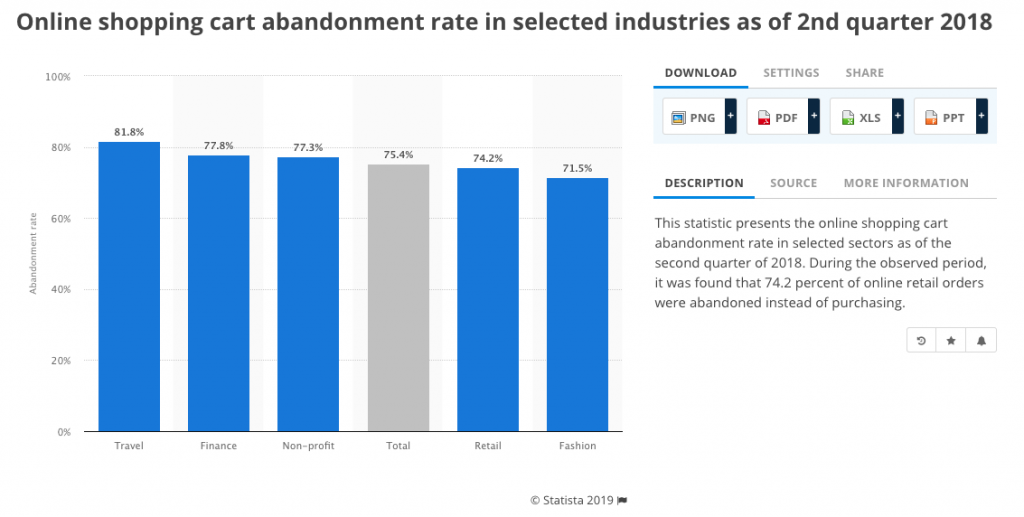
According to research by Statista, the average shopping cart abandonment rate in the second quarter of 2018 was more than 74%. Although the cart abandonment rate cannot be brought down to an absolute zero, app owners can definitely keep it as low as possible.
Table of Contents

The most interesting and equally important factor to curb the shopping cart abandonment rate is to understand that it all begins right at the app development stage. Keeping this factor in mind, we’ll talk about app development practices that will help you enjoy more successful purchases.
But before we do that, let’s take a look at the various reasons behind the high shopping cart abandonment rate.
Complicated checkout process brings down all the browsing experience in a jiffy. The harder you make it for your customers to make payments, the quicker they will leave the checkout page. Many ecommerce mobile app companies overdo the creative design and end up with a maze-like checkout page.
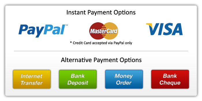
Some customers like to pay through credit/debit card, some prefer wallet transactions while some like the good old cash on delivery. When customers don’t find their preferred payment option, they will abandon the cart in a jiffy.
Bad design elements such as small buttons, tacky layout, poor quality images, and non-responsive design, all these come together to bring user experience down like a house of cards. Each of the problematic features come together to render a completely unusable app that can’t get things right at the first tap.
Bad design + bad functionality + bad interface = Bad user experience

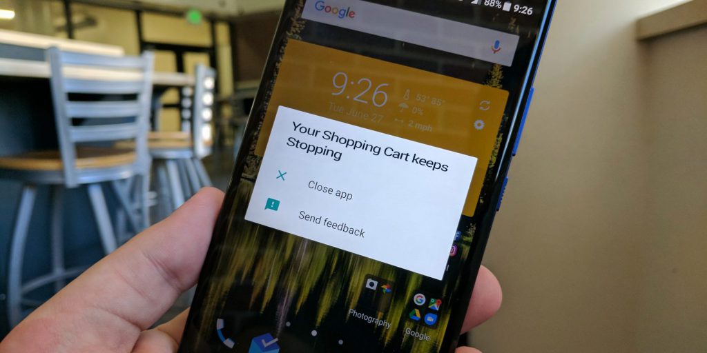
Badly built apps crash at random points. Not only such apps lead to dangerously high cart abandonment instances but also leave the audience utterly disappointed. Poor app quality is among the worst mistakes every mobile app developer should avoid.
Many mobile app development companies build great apps and test them for their functionality and connectivity. This is good, but the problem is that app connectivity and sync is tested using their own high-speed WiFi connections. App users won’t get the same connectivity everywhere, and they end up with an amazing app that doesn’t work so well under flaky internet connections. This leads to bad user experience and eventually, the cart gets abandoned.
There are few things that customers hate more than bad design, hidden charges being one of them. It obviously comes as a shock, but it also makes customers feel as if they are being duped of their money. It’s all going so well when suddenly, at the checkout page, customers see a long list of taxes and additional charges.
“Now that you know the key reasons that drive customers away from making a purchase, it’s time to see how you or your mobile app development company can fix these issues.”
The navigation of your ecommerce mobile app’s checkout page should be a neat, tidy and simple journey. Going from point A to point B should be a seamless journey. A very good idea will be to give the checkout page a stepwise layout where customers can see how close they are to closing the deal. It not only looks good, but the interactive nature of such a checkout page works wonders in enhancing user experience.

Multiple payment options give customers the freedom to make payments in whatever ways they want to. It has been proved time and again that companies that give their customers a plethora of payment choices enjoy better revenues and AOV. So, consult an experienced and premium app development company that integrates maximum possible payment options.
While your ecommerce mobile app is in its development stage, pay proper attention to how you want your app to look and work.
Begin with giving your mobile app a responsive and neat design. Doing so will help you deliver seamless browsing experience across all screen platforms.
At the same time, test the mobile app under limited network conditions. Make sure you keep the app light so it doesn’t break the buying journey. Moreover, update the said mobile app regularly so it doesn’t crash every now and then.
While you mention the cost of products/services on your ecommerce mobile app, make sure you keep all the taxes, delivery charges and other costs transparent. Remember, people don’t mind paying for delivery charges if they are getting good services from you. It’s all about building trust, and it begins with being transparent with your audience.
Abandoned carts are not only bad for revenues, they eventually bring a bad name to the brand. Companies keep focusing on bringing more potential customers on board, but seldom do they realize that it won’t lead to anything if the carts are left just like that. Bringing people to your ecommerce mobile app is just the beginning of the journey. How much do they buy from you is what matters the most.
Identifying the reason behind cart abandonment instances and working on them is the only way to fix this issue. The points we curated above will definitely help you improve your sales. Wishing you and your business with great success, we’ll see you soon with our next blog.
